
Chaloux
FRANCE STRATEGY VISUAL IDENTITY
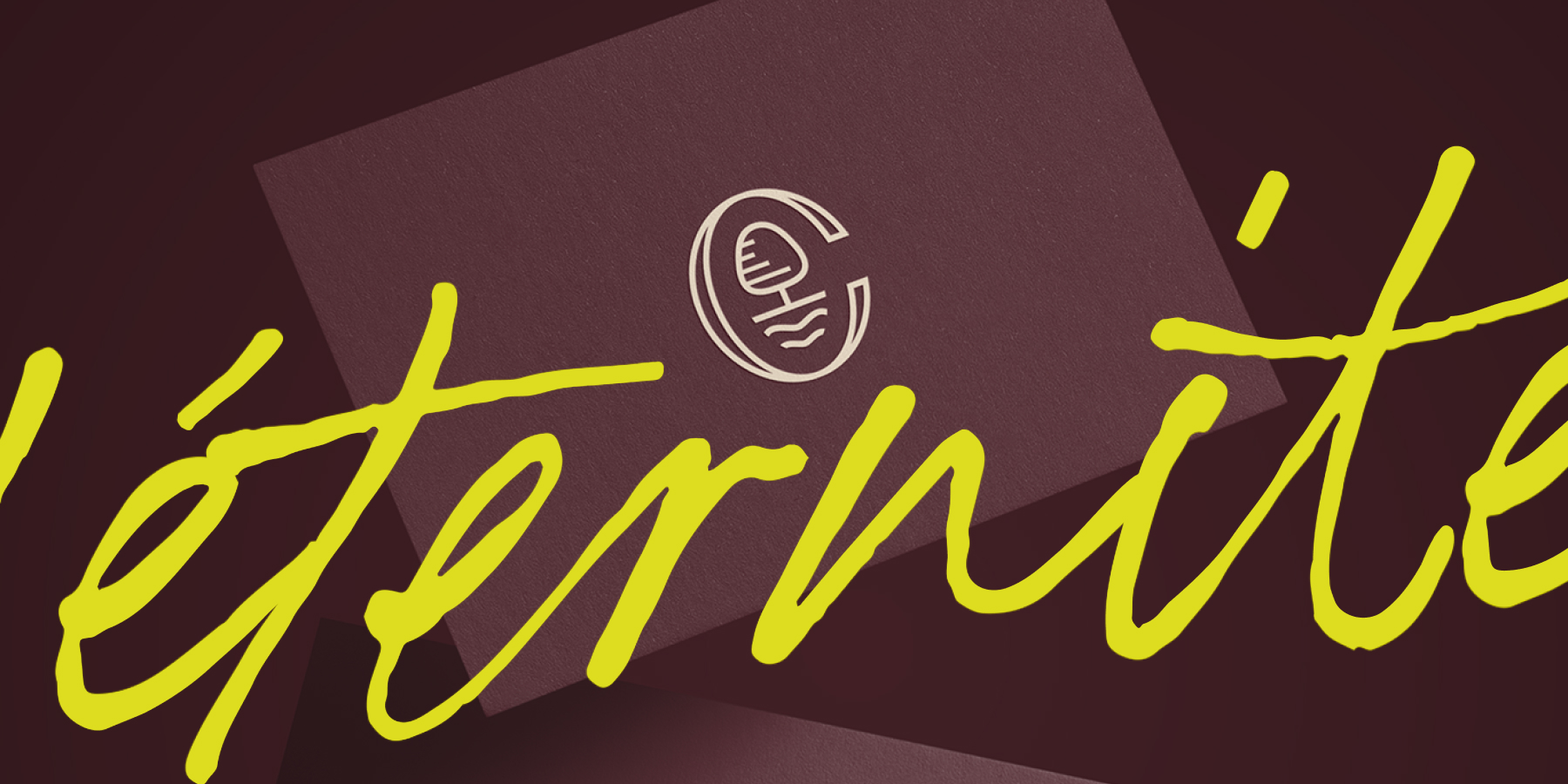

Imperial elegance. Reimagined for the modern collector.
The Problem
Chaloux Joaillier had been creating handcrafted jewellery in Fontainebleau for decades. Trained in the ateliers of the Place Vendôme, the founder brought genuine craft and a rare personal vision to every piece. None of that showed in the brand.
The identity was a single script logotype, elegant enough, but indistinguishable from a thousand others. With ambitions to expand into new markets, the gap between the quality of the work and the quality of the brand had become a liability.

Strategic Decision
The client knew he needed a stronger identity. He didn't know what that meant.
Before any visual decisions, I mapped where Chaloux actually sat in the market, between the grand maisons of haute joaillerie and the independent designer-craftsmen. That positioning revealed something important: Chaloux wasn't trying to be Cartier, nor a contemporary jewellery brand. It was rarer, a joaillier créateur with a specific craft, rooted in a very particular corner of France.
That place became the answer.
Creative Direction
Fontainebleau is not just an address. It's a Château, a forest, centuries of imperial elegance. It's also where Chaloux works, not in Paris, not on the Place Vendôme, but somewhere quieter and more grounded.
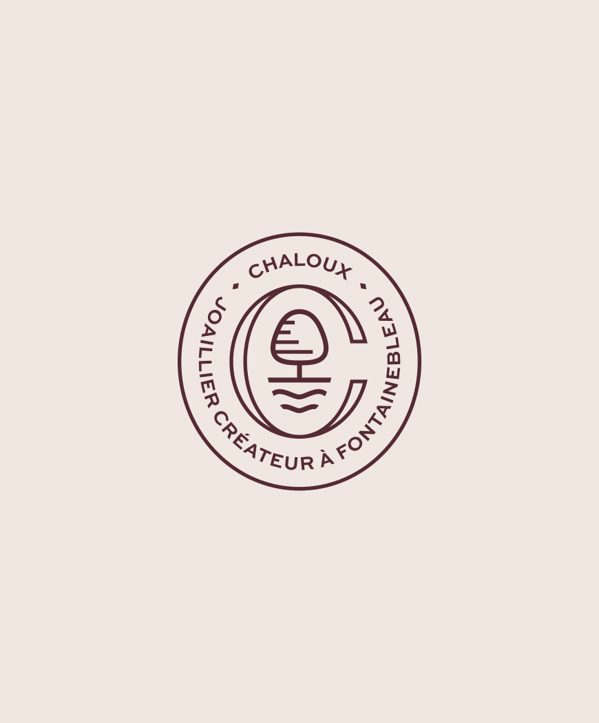
The symbol encodes that duality: a C embracing a stylised tree and the rippling lines of the palace, nature and grandeur in a single mark. The wordmark holds the same tension, mixing roman structure with a script Joaillier Créateur.

The creative platform: palace, forest, collector.
The Result
The final identity gave Chaloux something it had never had, a visual language with a point of view. The symbol works as a standalone mark, a wax seal, an embossed detail on packaging.
The colour system was built to challenge expectations. Imperial Rouge and Grand Cru anchor the brand in depth and history. Soft Coral, an unexpected near-yellow, cuts through as a signal of boldness. It's not the palette of a conventional jeweller.
For a brand expanding into new markets, the identity now does what the founder's craft has always done: it tells you exactly where it comes from.




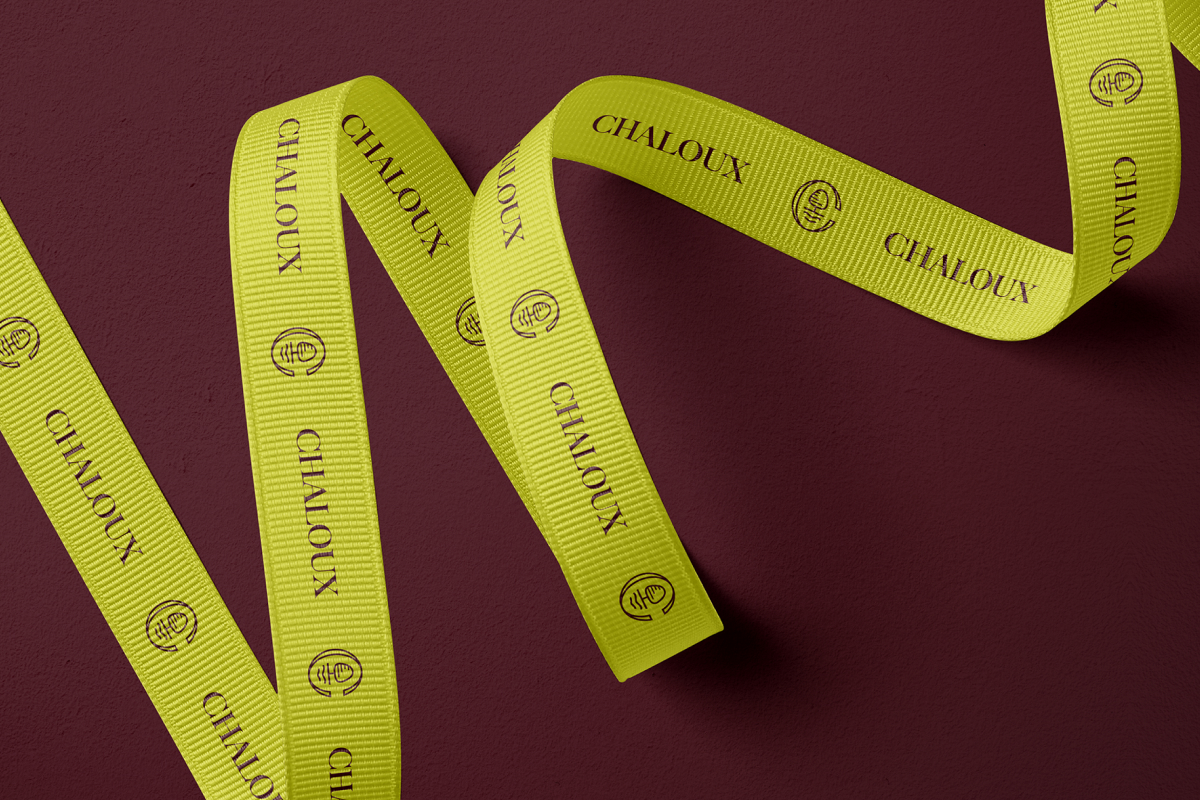
The Forêt ribbon, where the unexpected becomes the signature.

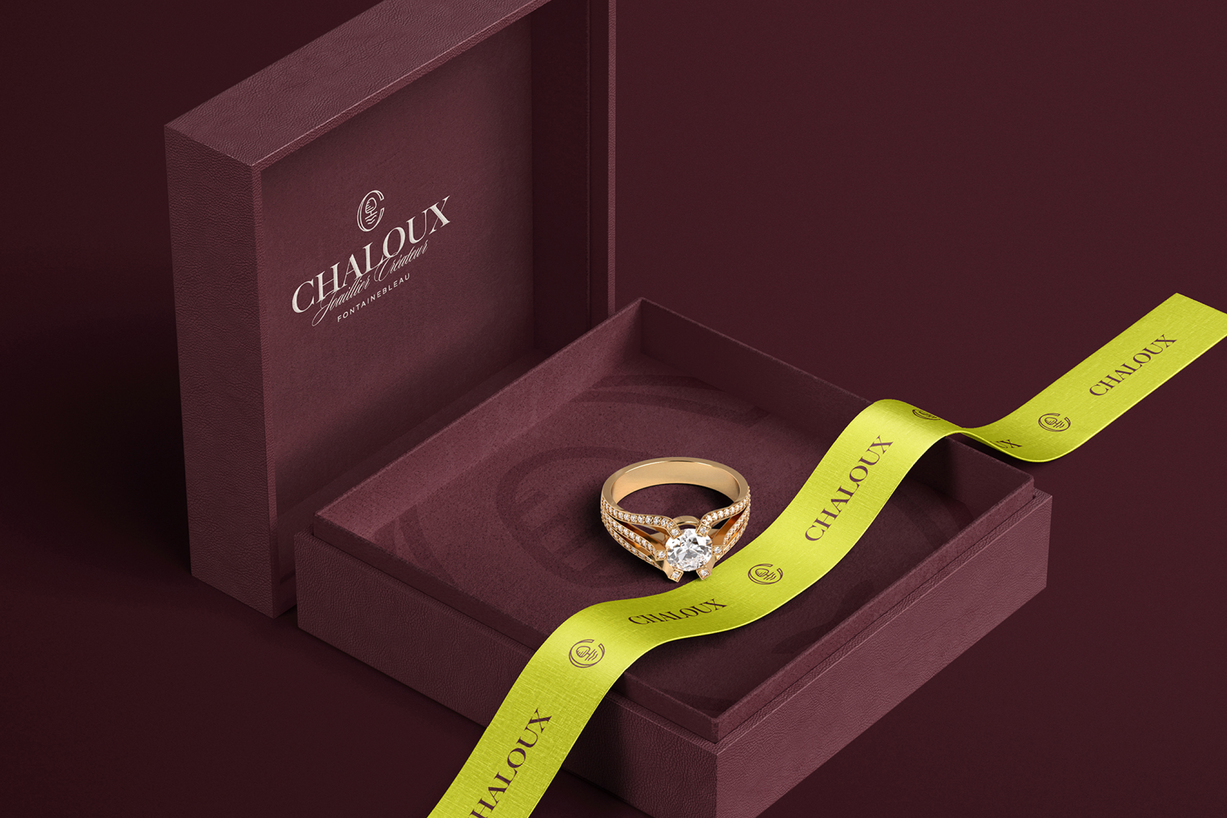
The jewellery box as the first impression, before the piece, the promise.

More projets

Have a project in mind, a new identity, a packaging concept, a brand that needs rethinking? Let's talk about where you want to take it.
jmpa.pt@gmail.com
© Apolinario Design 2011 - 2026.