
Poiēma
UNITED STATES BRAND IDENTITY PACKAGING


Ancient roots.
A brand built for modern wellness.
The Problem
Ejam wanted to launch a premium essential oils brand capable of competing directly with established wellness players, without the years of brand equity they had built. The challenge wasn't just aesthetic: it was to create something that felt genuinely rooted, not manufactured. A brand with a point of view.

Strategic Decision
The name Poiēma, Greek for "workmanship" or "a work of art", became the creative anchor. Rather than building around generic wellness tropes, the strategy was to position the brand through cultural depth: a wellness brand that felt earned, not assembled. Premium not through minimalism, but through meaning.
Creative Direction
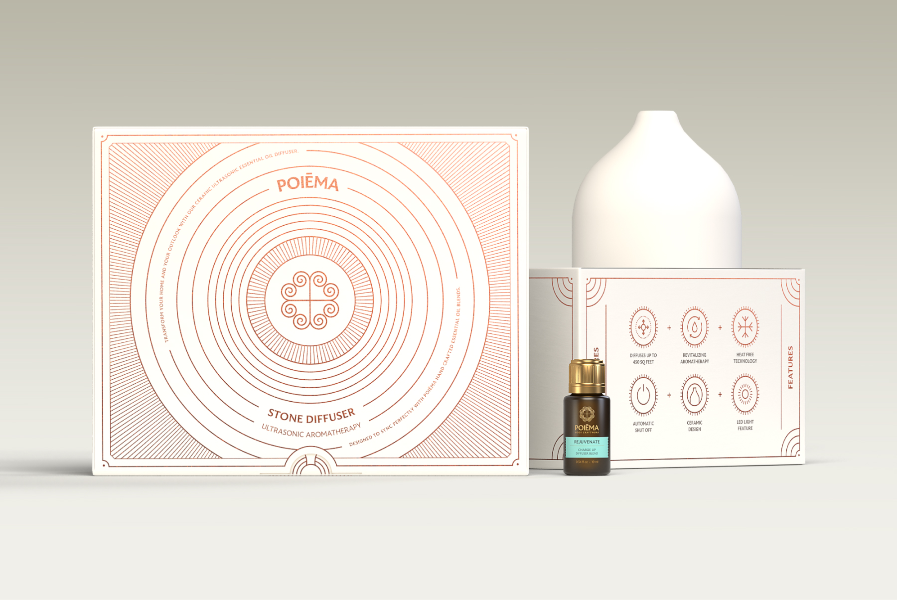
The identity draws from Ancient Greek symbolism and the Meteora region: a logomark combining the Greek Cross, the Ionic spiral, and a heart, three elements that together also form the letter "P." Typography echoed ancient stone inscriptions. The palette was pulled directly from the landscape: monastery green, terracotta copper, and warm stone grey.
Packaging followed the same logic, white cylindrical cartons with gold roll-on bottles, color accents differentiating SKUs without fragmenting the system.


The Result
The "A" symbol was stripped to its geometric core, strong enough to stand alone, simple enough to scale anywhere. The yellow-green gradient became the brand's energy signature: in a category dominated by corporate black and blue, it creates instant presence without sacrificing credibility. The full system was built to close the gap before a word is spoken.
Launched in September 2022, Ambitious stopped being a brand that needed to explain itself, and became one that speaks for itself.




More projets

Have a project in mind, a new identity, a packaging concept, a brand that needs rethinking? Let's talk about where you want to take it.
jmpa.pt@gmail.com
© Apolinario Design 2011 - 2026.