
Ambitious
NEW ZEALAND BRAND IDENTITY
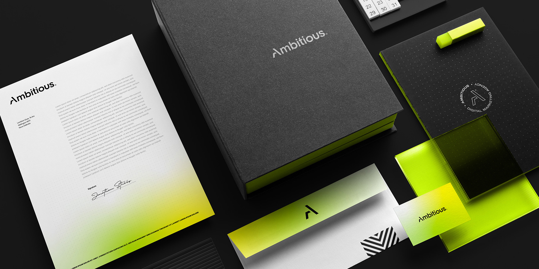

New Zealand's most ambitious agency. Just didn't look like it.
The Problem
Ambitious had a clear mission: to become New Zealand's leading growth marketing agency. The strategy was solid. The methodology was proven. But the brand looked like it belonged to a different company entirely.
The logo featured a manta ray beneath the words "Ambitious Digital — Creative Evolution." Visually incoherent with what the agency actually did, it signaled a brand that hadn't thought seriously about how it wanted to be perceived. In a category where image is proof of capability, looking unfocused is free advertising for the competition.

Strategic Decision
The first move was to drop "Digital" from the name. The best agencies communicate who they are, not what they do. That single decision reframed the entire brand.
A competitive audit confirmed the opportunity, the market was split between the loud and aggressive and the safe and generic. Three pillars defined the brief: Digital, Educational, Innovative. The space was wide open.

Digital

Educative
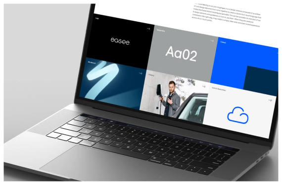
Innovative
The Result
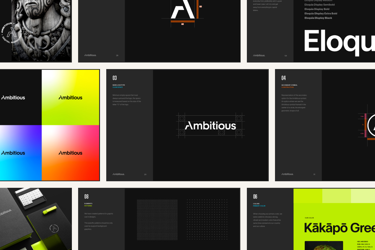
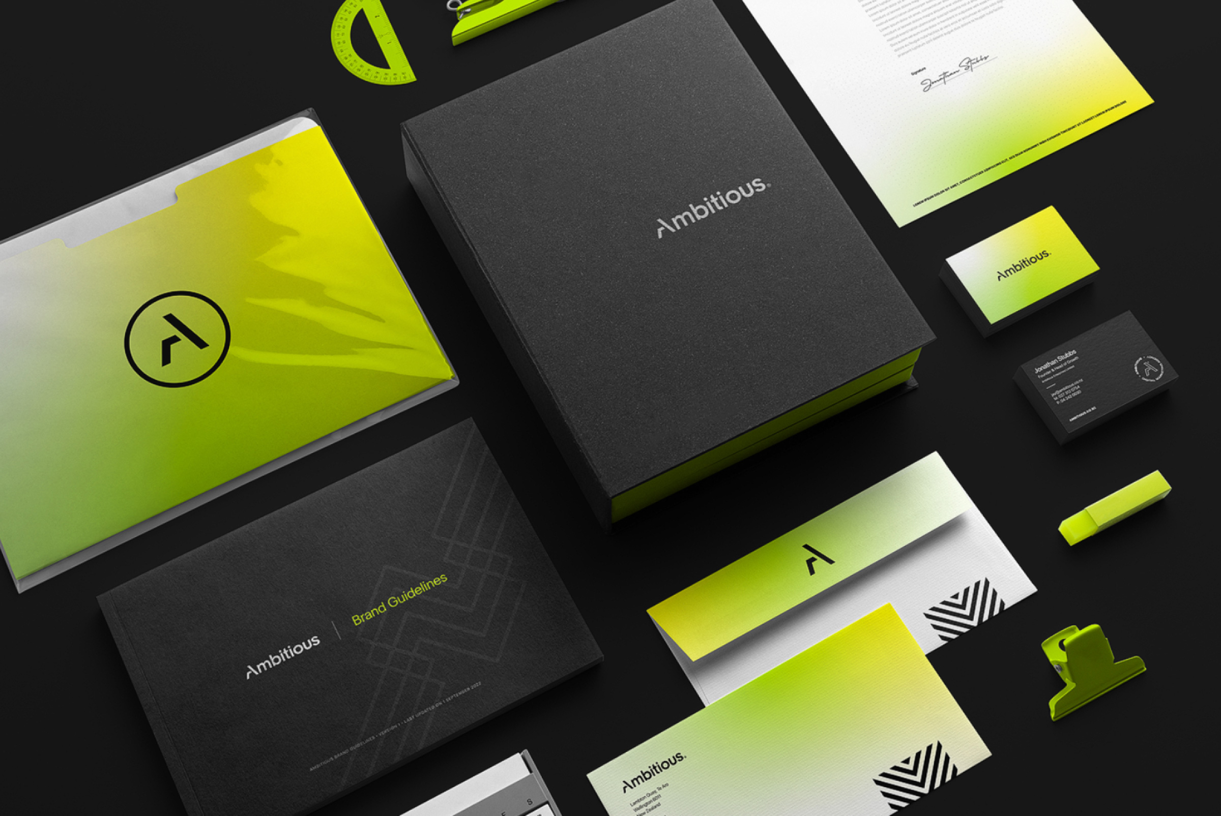
The "A" symbol was stripped to its geometric core, strong enough to stand alone, simple enough to scale anywhere. The yellow-green gradient became the brand's energy signature: in a category dominated by corporate black and blue, it creates instant presence without sacrificing credibility. The full system was built to close the gap before a word is spoken.
Launched in September 2022, Ambitious stopped being a brand that needed to explain itself, and became one that speaks for itself.









More projets

Have a project in mind, a new identity, a packaging concept, a brand that needs rethinking? Let's talk about where you want to take it.
jmpa.pt@gmail.com
© Apolinario Design 2011 - 2026.